Line Chart
Create a Line Chart
To create a Line Chart, the dashboard must first be switched to Edit Mode.
Clicking on the Add Widget button opens a dialog box displaying all the available widgets.
From this list, the Line Chart option should be selected.
This action opens the Create Line Chart dialog, where settings and data sources can be configured.

Configuring the Line Chart
The configuration begins with setting up a single data source.
- Value Name: The name of the value used to fetch the messages.
- Channel: The channel connected to the device being tracked.
- Client: The client associated with the selected channel.
- Label: A clear label for identifying each data source on the chart.
- Line Color: A chosen color for the line using the color picker.
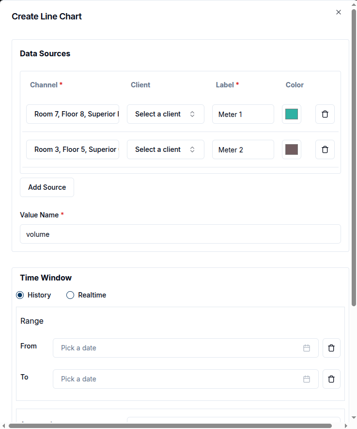
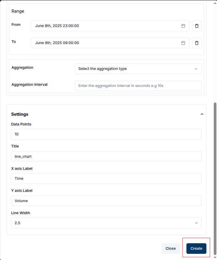
With the data sources defined, the next step is optionally specify a Time Window. This is done by selecting the "From" and "To" dates, restricting the data to a specific time range.

Alternatively, under the Settings tab, the Line Width can also be adjusted. This changes the thickness of the chart lines to suit visual preferences.

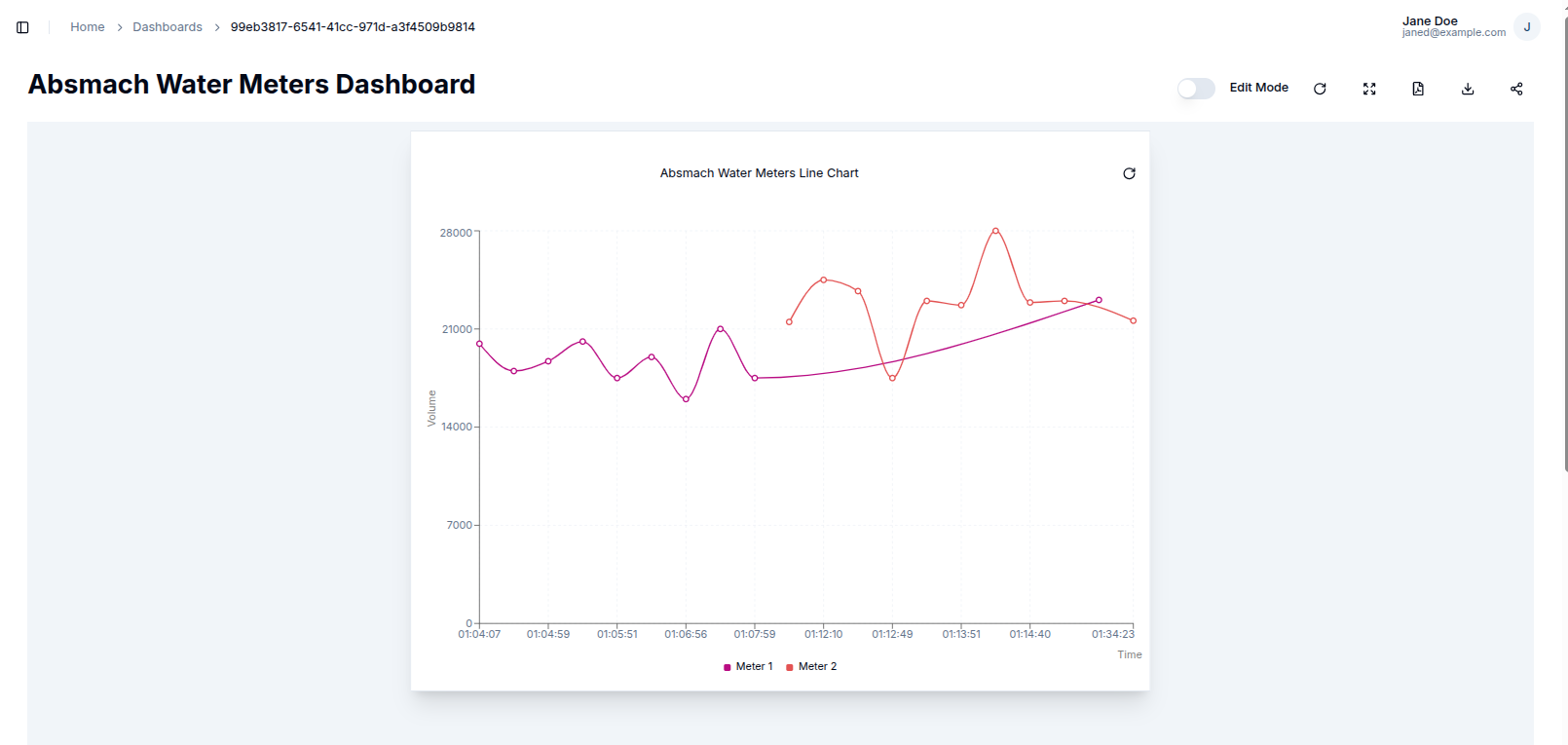
Once the configuration is complete, clicking the Create button saves the Line Chart widget. The dialog closes, and the new chart appears on the dashboard.
Edit the Line Chart
To edit a Line Chart, a user can click the pencil icon on the widget. This opens a settings sheet on the right, where chart properties such as data sources, labels, intervals, and the title can be updated.
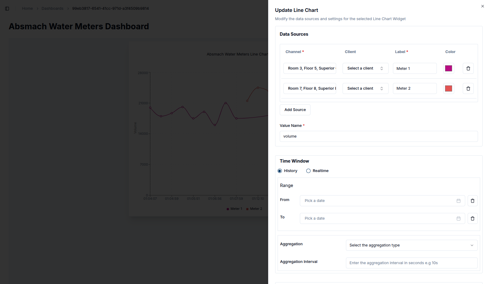
The chart’s data can be refined by adjusting the Time Window for example, narrowing the range to a single hour using specific From and To values. This ensures the chart displays only data within the selected timeframe.
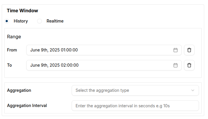
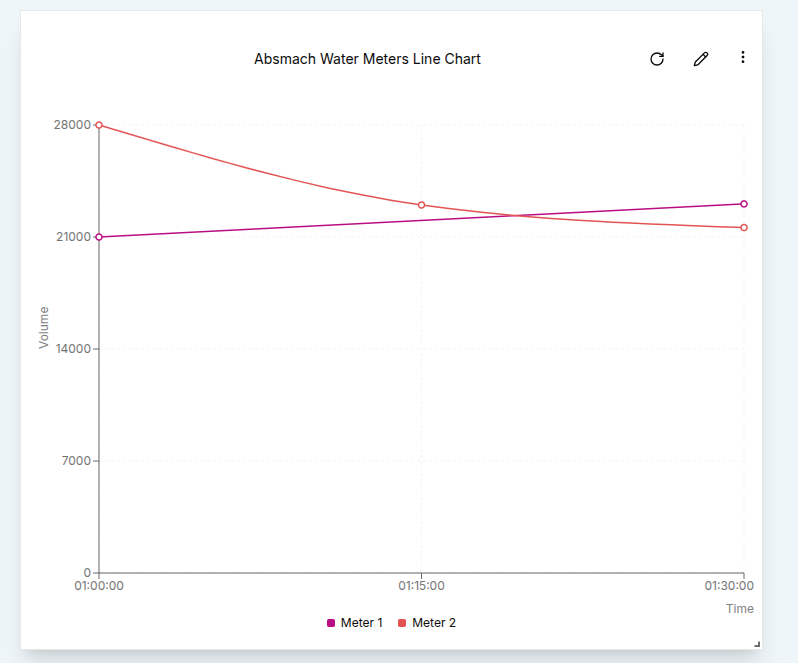
For deeper analysis, a user can enable Aggregation within the same settings panel. By setting a From date, To date, and an interval (e.g., 15 minutes), the data is grouped accordingly. This configures the query to return aggregated results.
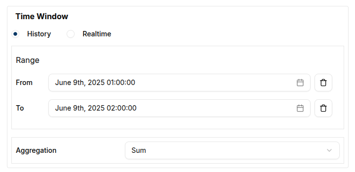
In the example below, the chart displays the Maximum values aggregated over 15-minute intervals within a 2-hour window:
After making changes, a user can click the Update button at the bottom of the settings sheet. A confirmation message (toast notification) will appear to indicate that the update was successful.
Conclusion
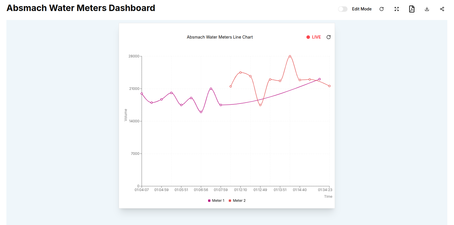
Line Charts are a powerful tool for visualizing trends and changes in data over time. They offer a clear and precise view of data points, enabling users to track fluctuations, compare multiple data sources, and identify patterns with ease. With customizable settings such as data aggregation, time windows, and line styling, Line Charts provide the flexibility needed for detailed analysis, helping users make informed decisions based on both real-time and historical insights.